

You’ve heard by now that you must have an author website. It’s nonnegotiable. It doesn’t matter if you’re self-publishing, traditionally publishing, or hybrid publishing—you need a website.
There are many reasons to establish an author website, but we’ll boil it down to the top three: accumulate an email list, drive sales, and build your brand. Your website doesn’t need to sparkle or to have mind-boggling features (although you can certainly add them later), but it should contain certain important elements. It also needs a touch of you—who you are to your readers. In this guide, we’ll go over the must-haves of an author website and more to get you started.
Must-Have Pages in Your Author Website
Home page
A home page should be straightforward, easy to navigate, and capable of driving action. Think of it as a highlight reel: showcase your most important things and make it easy to find out more.
Many authors use the home page to announce their news, whether that's promoting a new book or announcing a new event. ProWriting aid explains the importance of “visitor conversion.” This means focusing on eliciting action that will grow your business. When it comes to an author website, that means one of two things: getting a book sale or getting a sign-up for your email list. The article suggests either a book announcement or a free gift for an email sign-up, also known as a lead magnet. Some authors, like Mark Dawson, give away a “starter library” to every person who signs up for their mailing list. Starter libraries contain freebies from the author to get readers excited—ebooks, novellas, short stories, updates, book release details, and more.
A home page should include:
1) The latest book or any noteworthy announcement
If it’s a book, show the cover, give a brief description, and make sure the links to purchase are easy to find.
2) Email subscription box
You can subscribe to newsletter services, like FloDesk, ConvertKit, Mailchimp, or the increasingly popular Substack.
3) Headshot and preview bio
Don’t give away all your bio on the home page. Simply provide one or two sentences that end with a “read more” button and link to your About page.
4) Social media links
These are typically found on the top or bottom of the page, but you can also include links to your Contact page or About page.
5) Teasers or excerpts from your book
What other content might be interesting to potential readers? If you have a blog, make it easy to locate from the home page. Same goes with a Resources page, or links to any additional content.
About
Your About page should be one of the cleanest pages on your writer website. Who are you and what do you write? You can also supplement your bio with any personal story, accolades, or projects you’re currently working on. There is no length requirement. Maybe have two bios: a short and a long one. That gives visitors the option of the CliffsNotes version or something that is a little meatier. Remember that this is the space for readers to get to know you, so you can get more personal and describe your background, your path to writing, your inspirations, etc.
This page should also include a headshot—preferably the same as the one on your home page. And on the bottom should, again, be a space for the email subscription box.
Books
If you have published multiple books, each one should have its own page. Typically, the Books page features just the titles and covers, along with links to each book’s separate page. But if you only have one book, you can make the Books page just about that one. Here you can also include any links to articles or stories you have published online, either in journals or magazines. Again, if the list is extensive, consider giving each their own page.
The Books page should have:
Book cover, title, and subtitle
Full description (not just a blurb or inside cover jacket description)
Praise and reviews
Links to buy the book (including eBook and audiobook formats)
Email subscription box
What if you don’t have a book yet? Your Books page can serve as the preview. It may be a little sparse in the beginning, but fill it the best you can with the information you have. Put in a tentative title, short description, or cover. Anything can spark interest. The only thing that won’t is a blank page. Continually update the page to show readers that you are making progress—nothing is more frustrating than waiting for an author’s book with no end in sight. Use this page to take potential readers on a creation journey with you.
Even though he’s an established author, Brandon Sanderson is one of the best in the game at keeping fans in the loop. His website features “Progress Bars” to show where his works in progress are completed percentage-wise. Now that is going to keep readers coming back!
Contact
Like the About page, the Contact page will be no-nonsense and zero fluff. Most website builders have contact forms available for use, which we recommend. Although using a reputable service for your email helps keep spam down, it’s always good practice to minimize where you post your details like an email address and a phone number. Instead, use your website builder’s built-in form to get inquiries sent directly to you without compromising your information. Also, make sure that this page contains links to your social media accounts if you have them.
Blog
There is a lot of debate in the writing community about whether authors should have a blog. While we understand that a significant amount of work goes into maintaining an active and relevant blog, we recommend you go for it. Why? Because it drives traffic to your site. It makes you easy to find. It makes you accessible to others going through the same journey and endears you to potential readers curious about the writing and publishing process.
Your blog can offer general writing resources or more personal stories linked to your craft. Many authors use blogs to share peeks of their writing process and philosophy, others to announce upcoming events, and still others as a way of “brain dumping” information. But they all have the same goal: to start conversation and generate interest around themselves as authors. TIP: Include a sidebar linking to your website. This makes it easy for visitors to click through your site and find your other posts and content.
These are the writer website basics. Anything more (like an events, media, or services page) can boost your brand and books, but if you’re just starting out, we recommend sticking with fewer pages and adding to these basics as you create more content.
Must-Have Elements in Your Author Website
Think Simple
Less is more. It’s often true in writing, and the same goes here. If your website is overly cluttered, it will distract rather than inform. No one wants to spend time in a place that looks and makes them feel disorganized, and bombarding visitors with too much is a surefire way to ensure they never return. More importantly, a busy website tells them that there is no clear message to your brand.
N.K. Jemisin's website is a masterclass in simplicity. There are only three headings on her home page: About, Books, and Blog. Headlining the page is a quote from The New York Times, which concisely lets visitors know they’re in the right place to view the works of one of today’s most popular sci-fi writers.

Image by N.K. Jemsin at https://nkjemisin.com/
Be Purposeful
All author websites have the same purpose: to get readers to buy their books and sign up for their mailing lists. This means that the first page people land on needs to clearly articulate what you do. The website’s focus should be you, the author, and your books.
It can be difficult to look at your website with objectivity, just like it’s hard to edit your own work, so ask others to preview it. On each page is it obvious you’re a writer? Do your visitors understand the intention of each page? Is it clear what the visitor can or should do next? Do you have clickable links to purchase books or sign up for the mailing list or newsletter? These need to be short, focused, and clear without being intrusive and annoying.
Amor Towles’s website is a great example of a site that doesn’t deviate from its intended purpose. His home page is simple with his three books front and center (plus purchase links), a button to his Contact page and social media platforms, and headings to his other pages, which are clearly labeled. Another feature we love about his website is that underneath each book heading on the home page, he has broken the subsequent pages into clear, purposeful subheadings so there’s little risk of confusion. And though he has more pages dedicated to each book than the average author—with pages like Lincoln Highway History, Book Group Questions, Gallery, Q&A, Music—none of them feel like they are cluttering his website because they are categorized and each have a very specific purpose. Even with his more miscellaneous pages, we see that they are intended as second-tier levels of information to give curious readers a behind-the-scenes look of his writing process and the extent to which he went into researching for his books.
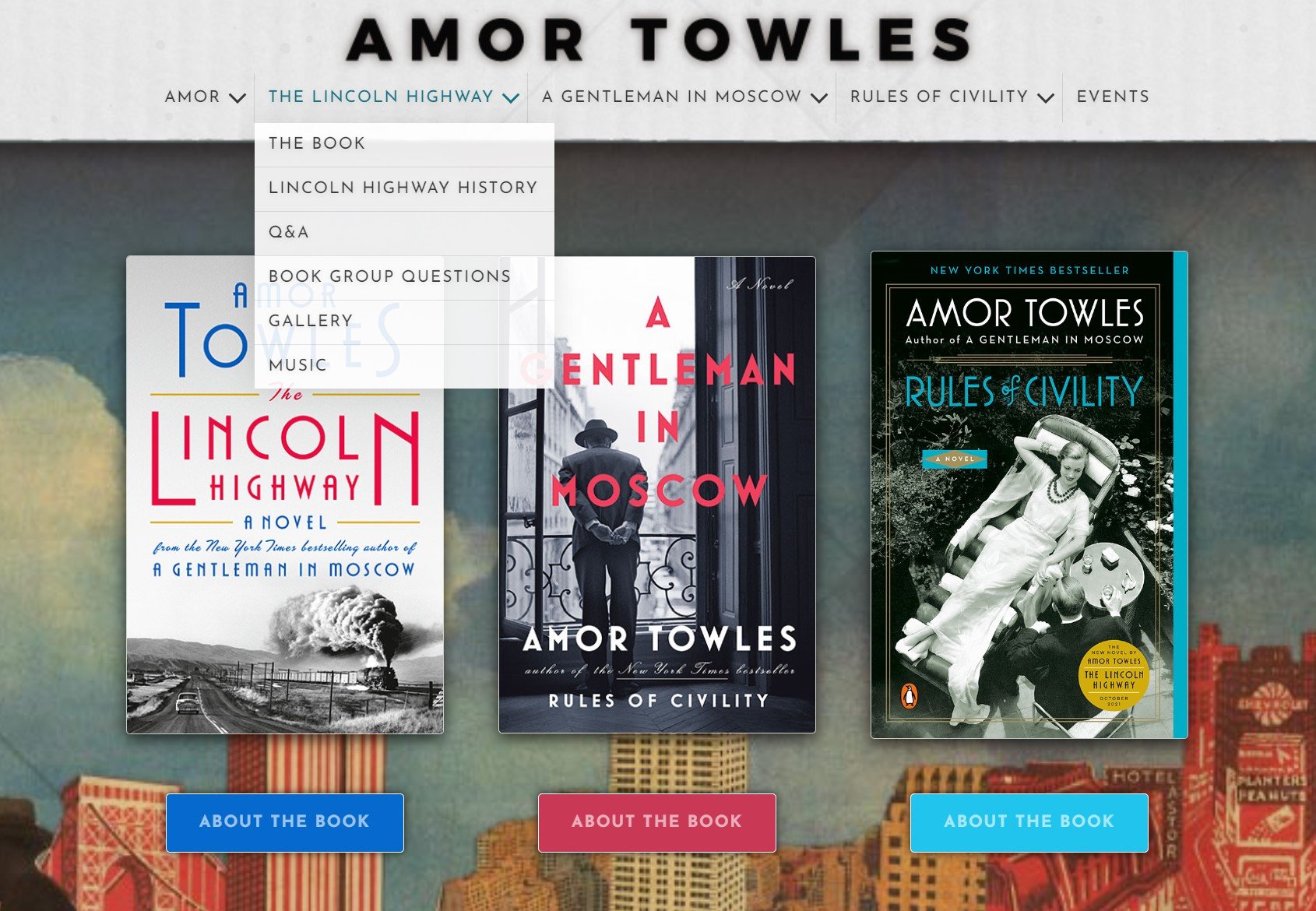
Image by Amor Towles at https://www.amortowles.com/
Strike a Feeling
Similar to writing, website content should invoke a feeling that captures the essence of your books. This can often be tied to your genre—if you write thrillers, suspense, or mystery, your design may feature darker colors and an obscure atmosphere. If you write romance, opt for a lighter palette and bright colors like red to stimulate emotions. The options for design style are endless, but remember that these authors likely work with a professional website designer. If that’s something that fits your budget, make sure the different approaches to style is something you discuss with your designer. Play around and try out each style by yourself first so that you can inform your designer on the preferred creative vision for your brand.
Take, for example, Paula Hawkins’s website. The minute you land on any page, you get the feeling that you’ve just fallen into a dark mystery. There’s a feeling that something isn’t quite right, yet it also ignites a burning curiosity. The flames licking each side of the page are an homage to her latest book, A Slow Fire Burning, and their vibrant colors lend to that deep sense of intrigue.

Image by Paula Hawkins at http://paulahawkinsbooks.com/
Compel Curiosity about You
Your author website should be intriguing. It should be you—and only you can figure out what that means. But think about this: every website has something that sets them apart, some oddity or quirk that makes readers think, yeah, that’s them. That’s what they are about. For Sandra Cisneros, it’s her letters to readers, ones she’s been writing since 2009. For Rupi Kaur, it’s the artful layout of her site, the use of whitespace and text alignment that makes you feel like you’re reading one of her poems—and which may just push you over the edge to purchase a collection. Ingenious and unique.
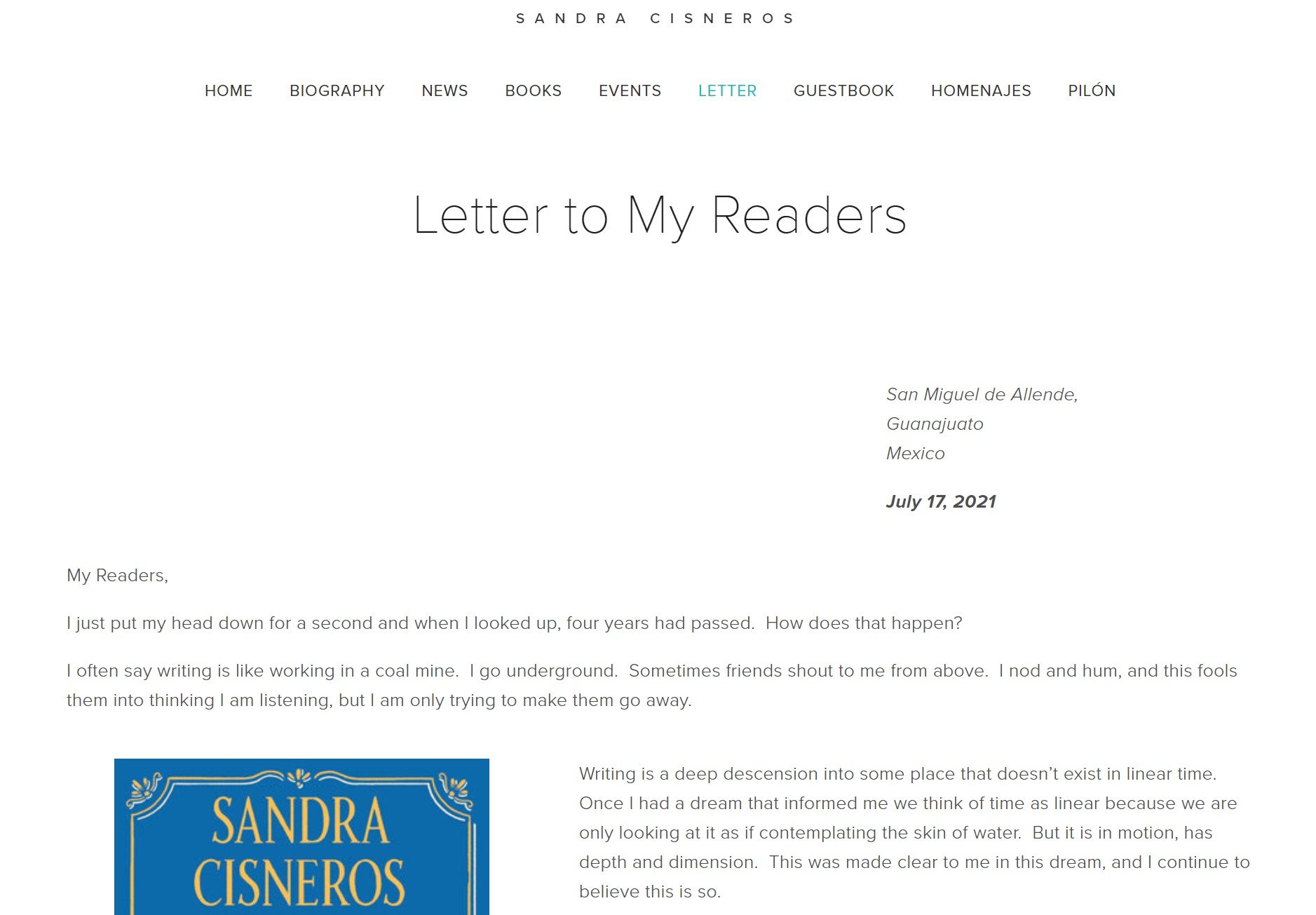
Image by Sandra Cisneros at https://www.sandracisneros.com/letter-1
Make Your Author Website Your Own
As you take steps to curate ideas and inspiration for your author website, keep in mind that no two will ever look or feel the same. There are endless possibilities to creating your own website and brand, and everything shared here is simply a set of guidelines to get your process underway. Remember: everyone started small. Every big-name author out there had to start where you are—their websites didn’t begin as the ones you see now. So even as you take in information here and elsewhere, keep in mind that building an author website is a process. It’s a long haul, not a click of the button. Find out what you need right now, what you can dedicate for later, and put in the work to make yourself and your brand personable and accessible. Grow your audience. Offer freebies and cultivate your mailing list. Figure out who you are to your readers, and let that be the driving force behind your website’s anatomy.