

The number of books published each year is estimated to be somewhere between 600,000 and 1 million. If you want your book to be a success, you need to do everything in your power to help it stand out among the admittedly massive crowd. One of the best ways to do that is by choosing an absolutely eye-catching cover for your book.
Fortunately, there are some tips and tricks you can employ to come up with a cover image that’s a step above the rest. It also helps to get some professional assistance along the way so the finished product looks undeniably sharp. Let’s take a look at some of the best tips to make sure your book cover is a head-turner.
Must-Haves for Book Cover Design
While there are lots of different types of design strategies you can use to make a compelling book cover (and we’ll cover those in the next section), there are a few essentials that your book cover needs no matter what. These elements should be included in your cover design regardless of what direction you decide to go with in terms of imagery. Here are a few tips to keep in mind as you come up with your initial ideas for a book cover.
Convey Meaning
Above all else, your book cover must convey meaning. A beautiful cover is attractive to a potential reader, but if it provides no idea of what type of book it is or what it’s about, it will fail to pique their interest in the writing itself. You want your book cover to give readers an idea of what to expect, even if it’s just the slightest hint at what type of narrative or information is tucked inside. Ideally, you’re looking to present both style and substance.
This book cover for Matthew Desmond’s Evicted is an excellent example of conveying meaning through an image.

Think Small
For decades, books were purchased by being plucked off the shelves. But today, designers have to contend with the fact that a huge chunk of book sales take place online. Inevitably, that means that covers are viewed on smaller screens, so the designs must translate well when the image appears on a computer or phone. That doesn’t mean you can’t include intricate details on a cover. However, the design still needs to look attractive to readers even when those little details aren’t easily visible on a smaller screen.
In this cover for At Home in the World: Reflections on Belonging While Wandering the Globe by Tsh Oxenreider, there are lots of interesting details incorporated in the design, but the house silhouette is still plain to see even if the image is reduced in size.

Use a Compelling Color Palette
Choosing the right colors is essential to a successful book cover. The hues you use shouldn’t be picked at random. Instead, they should complement each other and fit the overall mood and themes of your book. Some simple-yet-effective options include a monochromatic look with different shades of one color or a complementary color scheme with contrasting colors.
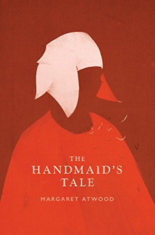
Yann Martel’s Life of Pi uses a complementary color scheme with blue and orange, while this cover for Margaret Atwood’s The Handmaid’s Tale uses a monochromatic color scheme with shades of red.

The cover for A Recipe for Hope: How We Fought Cancer with Family, Faith, Friends, and Food by Jeffery Weaver is a great example of the three tips from this section being put into action.

This book cover accomplished the following:
Convey meaning: The apple with a heart and green background hints at the book’s focus on healing nutrition.
Think small: Because the design is simple and straightforward, the apple and title are still easily visible in a smaller image of the cover.
Use a compelling color palette: Green is associated with health and wellness, and the red apple provides an appealing visual contrast.
Different Approaches to Book Cover Style
Now that you know about some basic principles that will help your design succeed, it’s time to figure out what cover style you prefer. There are lots of different elements that can result in a beautiful and compelling book cover, whether it’s interesting photographs, detailed illustrations, or unique fonts. No single formula is proven to be the most effective, so it’s really about choosing the style you like best and doing it well. Consider incorporating some of the following elements into your design to create something that will stand out on the shelves and on the screen.
Create a Sharp Contrast
A bold contrast in your book cover design can help to pull the viewer’s eye toward what you want them to notice. Contrasts are often thought of in terms of color, but it can also be created with shapes by placing angular shapes among soft, curved ones. Notice how your eye is naturally inclined to move toward the contrasting areas of the following book covers.


Find a Provocative Image
There’s always the option to use a photograph for your book cover, but make sure it’s one that really draws the reader in. This should be a photo that helps to tell your story and gives an idea of what to expect from your book. Ideally, it makes readers want to click on the image or pick the book up off the shelf to learn more. The cover for Cannibals in Love by Mike Roberts is part sensual and part disturbing, but it’s something you almost can’t take your eyes off of.


Go Minimalist
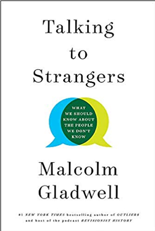
A minimalist look can be incredibly effective. It strips down the design to the bare bones, which can help your book stand out on shelves while also providing a meaningful image. An uncluttered look like this can be very visually appealing to readers since it’s easy to understand with a quick glance. In addition, minimalist styles often have a more timeless look, so you don’t get stuck with a design that looks dated after just a few years. The cover for Talking to Strangers: What We Should Know about the People We Don't Know by Malcolm Gladwell elegantly presents its core concept with just two overlapping speech bubbles.

Create the Illusion of Texture
Books are so uniform in size and shape that they can all blend together when looking through a variety of covers. One trick to get yours to stand out is to make yours appear as though it has a three-dimensional texture on the front. Besides making the design eye-catching, the illusion of texture makes readers want to reach out and touch your book. When you view other covers that have done this successfully, it’s easy to see how this design strategy can make the book more appealing to readers. Don’t you just want to rip back that paper on the cover of The Goldfinch by Donna Tartt to discover what’s hidden underneath?


Use Text Creatively
When coming up with a cover design, it can be difficult to integrate text with the imagery you want to use. Some of the most effective book covers find an imaginative way to utilize fonts and text colors and incorporate the title and author name into the design. For example, the text itself might create a shape, like with the cover for On the Okey Dokey Trail: A Smart-Aleck Perspective on the Give and Take of Life by I. Leigh Private.


Incorporate Vintage Elements
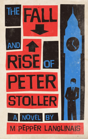
Retro styles can add a bit of a cool vibe to your cover, especially if it happens to tie into the themes of your book. For example, you could use vintage fonts and colors associated with a certain decade to indicate when your story takes place. This is the technique used for the cover of The Fall and Rise of Peter Stoller by M. Pepper Langlinais, which takes place in 1960s London and features a distinctly mid-century modern look (a la Saul Bass) in the design. You can also consider incorporating various retro elements to help your book cover appeal to your target demographic.

Bringing Your Vision to Life
Spend some time looking at other book covers to get inspiration for your own. If you see some that have design elements you like, take a photo in person or save the digital images to a folder for reference. Pinterest is another great tool for collecting inspiration images for your design.
Once you have some cover ideas in mind, you may want to put together a mockup of your design. If you’re not a whiz with design software, you can use a simple online tool like Canva to get an idea of what it would look like. You can even use free templates if you need a little help getting started.
While it’s very helpful to come up with your own ideas of how you’d like your book cover to look, most authors hire a professional to finalize the design. Just like hiring editors for your book, working with a designer will ensure that your book cover looks polished and professional. In addition, a pro can help you decide between possible ideas for covers if you’re not sure which way to go in terms of art direction. Your designer will also be able to create your final cover in various digital formats and sizes as required in the book industry.
Creating a visual concept for your book can be incredibly refreshing when you’ve only seen it in black and white text for so long. By hiring a designer, you can make sure your book cover is exciting and eye-catching to potential readers. No one knows a book as well as its writer, however, so make sure you’re closely involved with the development of its cover.